Freelance Creative Director
Agency: emc3
The Mozilla project was founded in 1998, when the Netscape browser made the radical decision to give away its program code to the public to build on and improve. Eventually, the open source Mozilla project morphed into the widely popular first version of Firefox.
Today, Mozilla continues its movement toward a better internet with millions of active community members spanning the globe, advocating for ethical tech, trustworthy AI and producing privacy-first products that give more power to the people.
The agency emc3, who was pitching for their employee’s global event brought me in to elevate the existing branding proposal. And we won the pitch!
The existing identity proposal

THE CHALLENGE
While the team was happy with the strategy and naming of the event for the proposal, the design direction didn’t excite them. As a final push to win the pitch, the agency looked for a different approach, something 'special’. And as vague as the brief sounded and 3 days in hand to turn this brief around, I took on the challenge.
THE APPROACH
Upon reviewing the existing design proposal, I realised a key element was lacking: the essence of Mozilla. The design presented was neat, clear, and corporate, suitable for a typical tech firm. However, it fails to reflect Mozilla’s identity as a pioneering activist organisation.
I set out to inject that activist attitude into the design direction. I wanted something that felt current, edgy and full of excitement. Something bold, versatile and playful just like Mozillians themselves. At the end of the day, it’s the main purpose of the event: to bring their employees together and celebrate them.


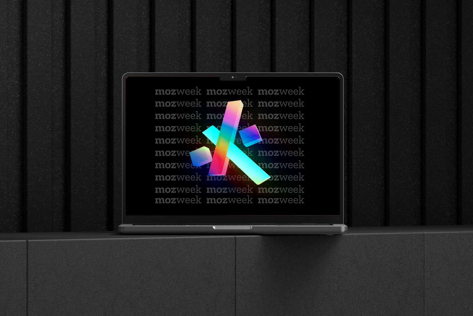
For the brand mark, the existing design blended a fox tail (as a nod to FireFox’s logo) with an asterisk. While I wasn’t keen on this combination, and it’s not visible in small applications, I loved the idea of the asterisk. Its primary use is to draw attention, and in programming, the asterisk means multiplication. In some programming languages, it separates working code from comments. This fit nicely with the nature of the event, the brand and its history.
So, how could I tie the asterisk, the brand culture and the goal of this event all together?
So, how could I tie the asterisk, the brand culture and the goal of this event all together?

THE IDENTITY:
I went back to study the history of Mozilla’s branding, trying to find new inspiration. And then I saw it. At the heart of the current branding are the “I” and "L"s represented by a colon and two forward slashes – as would appear after the HTTP in a URL. I wanted to incorporate this much-loved asset into my design as a nod to the company’s mission.
While putting the asterisk and the :// side by side, the similarity became clear: they are both made of straight, solid shapes. The deconstruction of the asterisk results in 3 separate shapes, resembling the ://
This playful take on the good old asterisk brought me a versatile symbol that draws attention, while also communicating the brand’s exponential impact on the internet.
The making of the proposed identity


Various touchpoints

Countdown to event day
THE COLOUR
As I drew inspiration from Mozilla's rich colour palette and the essence of openness, diversity and positivity, Prism became a natural choice for the theme. It represents movement, magnified optimism and a shift of different perspectives. A burst of energy, full of excitement and joy. A beacon of light.
As I drew inspiration from Mozilla's rich colour palette and the essence of openness, diversity and positivity, Prism became a natural choice for the theme. It represents movement, magnified optimism and a shift of different perspectives. A burst of energy, full of excitement and joy. A beacon of light.

THE MOTION
To demonstrate the concept of coming together, individual pieces of the identity fly in and unite in the centre, and then continue to rotate and shine as they do. The prism theme colour stays consistent throughout, implying that Mozillians are nonetheless a beacon of light themselves, and they shine individually and collectively. This approach celebrates their individual achievements without downplaying the role of togetherness.
To demonstrate the concept of coming together, individual pieces of the identity fly in and unite in the centre, and then continue to rotate and shine as they do. The prism theme colour stays consistent throughout, implying that Mozillians are nonetheless a beacon of light themselves, and they shine individually and collectively. This approach celebrates their individual achievements without downplaying the role of togetherness.
